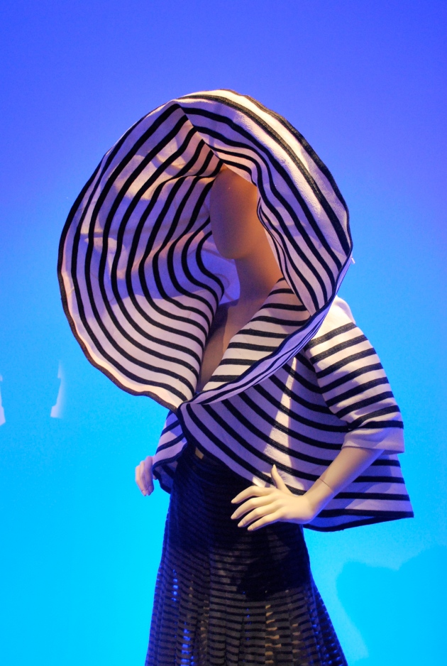
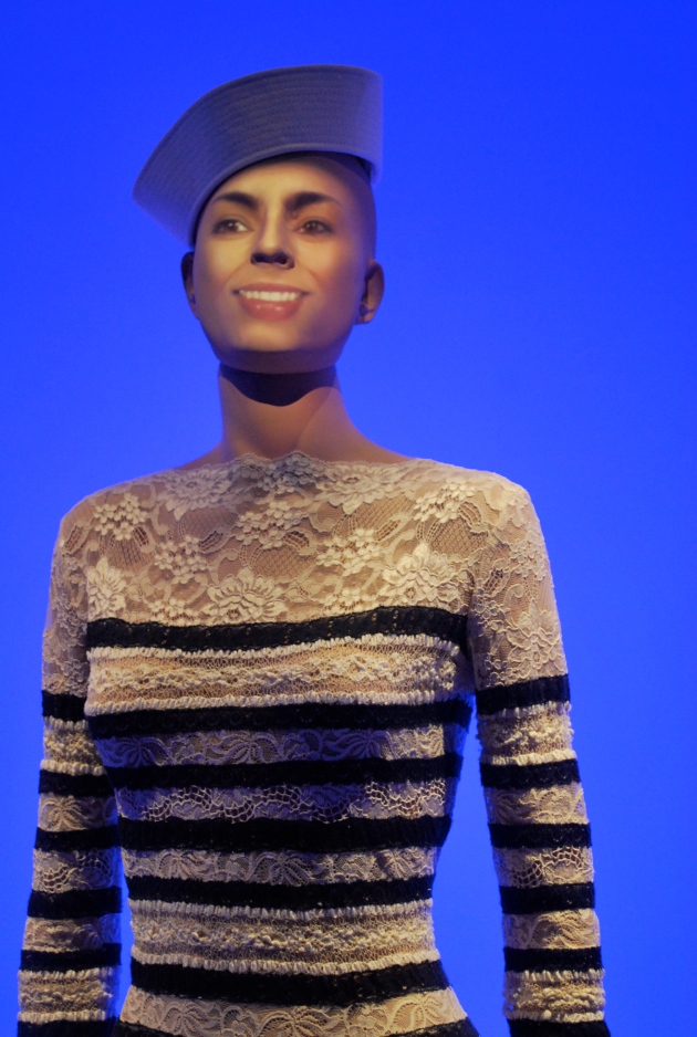
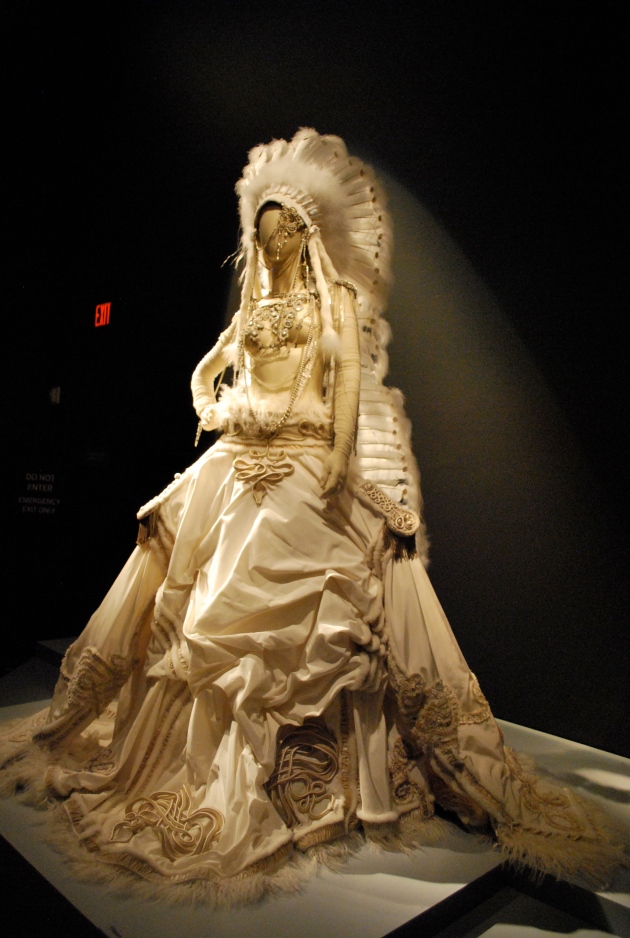
Just in case you thought I had abandoned ship, (I was just distracted by the Olympics and The International Edinburgh Festival) I thought I would share my photographs from the Jean Paul Gaultier exhibition at the de Young Museum, San Francisco taken in July.
As I am not a fashion writer, I will not attempt to elaborate on the various themes and ideas behind Jean Paul Gaultier’s designs over the decades apart from to say that he is highly influenced by his grandmother whom he idolised and her collection of cloths. His designs celebrate the female form, sometimes with humorous undertones but always in ways to project inherent powers and strengths he sees in women.
As we all know, interior trends are deeply entwined with fashion trends and while looking at Gaultier’s mannequins (which incidentally and quite unnervingly start speaking when you approach them) I enjoyed visualising potential interior projects with the colours, forms and themes Gaultier uses in his spectacular designs.
I am thinking Nautical boathouse fused with the 2012 trend for lace detailing – something Scottish lace mill MYB Textiles has been at the forefront of.
And the opulent and dominant boudoir interior…
and the current paint trend for David Oliver’s metallic mix of gold and silver for which he coined the term ‘gilver’. Celebrating the ‘hedonistic exuberance of the 1920’s ….associated with drama, power and wealth…but equally it can be simple, understated and quietly bewitching’, David Oliver from Paint & Paper, A Master Class in Colour and Light.
with a nod to the current native interior references,
and tribal chic a predominant interior trend in 2012 where skins have been used extensively over many forms of seating – more frequently sheepskins and deer skins draped over classic mid twentieth century Scandinavian designs.
Okay, so my parallels are a little tenuous but nevertheless they are all themes which have played a part in recent interior projects including this next image fusing punk, biker -rock, street with tartan, probably more in bars than domestic interiors but a strong influence for sure.
Talking of trends and themes, the most talked about colour for Winter 2012/13 appears to be Ox Blood, not a description I hugely cherish, perhaps an earthy beetroot cordial sounds more appealing but as it’s colour combinations that interest me I am paring the Ox blood with some squid ink (!) and I can suddenly see how this rich palette could make a big impact this Autumn.


I thought you had been absent for a while Niki! I have been the same, but I think a rest from blogging is good. I love the Ox blood with the squid ink, it reminds me of Rothko’s paintings.
LikeLike
Oops, well its nice to know you noticed my prolonged summer blog free zone 🙂 I am really affected by the seasons and I really can’t bare being indoors when the weather is good, well that’s my excuse anyway…
Ooh, a Rothko reference, nice! I adore his work.
Be in touch x
LikeLike
Glad you’ve been able to see the western US — Las Vegas is definitely a change from Scotland. And thanks for posting photos of the Gaultier exhibit; I’m based in SF but haven’t even had a chance to visit myself. Reminds me of the McQueen exhibit a few years ago–perhaps they were inspired by similar things?
LikeLike
Yes, I noticed on your blog you are San Fran based – how wonderful! We had an incredible time there and seemed to pack in so many things including a cycle over to Sausalito, a trip to Beach Blanket Babylon,the wonderful Ferry Building, as many museums and galleries are we could cram in, a tram ride, Lombard Street, lots of wonderful meals including a fab one in The Salt House, a trip to Amoeba Records – you name it, we loved it but it was the people who made it special for us as they were all so friendly and incredible helpful. A wonderful place!
Thanks for your kind comment, the exhibition was staggering – I do love McQueen too, he was such a creative man. I think the staging made the Gaultier exhibition extra special (it was a theatre company who were involved with the set up – it show as it was full of drama).
LikeLike
Interesting collection of fashions – it’s cool that they could all be interpreted as interior designs. I really like the plaid/punk look 🙂
Ox blood and squid ink aren’t the prettiest colour names, but they look great together 🙂 I could see this colour combo in a library or study.
LikeLike
Hi Kelly, you have a great knack of getting the colour just right for each location and I think you are absolutely bang on with the dark ox blood & squid ink being good for a library. I like that idea a lot. A blogger friend over at Broadside blog once told me to watch the film, ‘The Last Station’ (a film about Tolstoy’s life) because she loved the deep blue walls in his study. I hired the film and was blown over by the colour too.
LikeLike
deYoung museum is great…I hope you went to the view tower to get an overview of the city =)
LikeLike
Hi Frances, well what an amazing tower/building but sadly the city was covered in thick mist for much of the time we were there – a great excuse to go back and have another look!
LikeLike
Those mannequins would’ve scared the beejesus out of me, especially when they started talking. Yikes! I can see why Gaultier is so influential, and how he might speak to your thoughts on interiors. I was especially intrigued by the nautical/lace idea – almost wearable! As for the oxblood, yes earthy beetroot cordial sounds about right to me. Slainte!
LikeLike
Agreed! I jumped out of my skin when their heads turned and started addressing me! Very Dr.Who.
Thought you would like the foodie slant on the re naming of colours!
LikeLike
PS So glad to have you back, but very glad you were able to enjoy summer off with your family.
LikeLike
Ooh, thanks, Kellie, too kind. 🙂 Its good to be back now the weather has decided Summer is well and truly over.
LikeLike
Super photos Niki! Wish wish wish I could’ve seen this exhibition. And I love the ox blood and squid ink….makes my old school uniform seem less grim (I still can’t wear maroon and I have trouble with navy)!
LikeLike
Thanks Claire, haha! you made me laugh out loud there about school uniform colours – I see what you mean too! I think maroon has affected quite a few people including my husband who had to wear maroon (ish) which was heading off towards purple on the spectrum (eek!). I think I escaped very lightly with white and inky blue 🙂
LikeLike